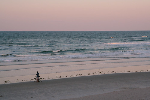
My favorite Pebble Beach pic was included in a Schmap guide.
I’ve let Schmap use several of my photos. Here’s how the describe themselves:
Schmap is a leading publisher of digital travel guides for 200 destinations throughout the United States, Europe, Canada, Australia and New Zealand. The innovative technology behind Schmap Guides is also used by clients, partners and bloggers to power schmapplets – a range of fully customizable map mashups and map widgets.
They found my pics through Flickr. On Flickr, you can choose to make your photos available though a Creative Commons license… or not. I have my photos listed under a Attribution-NoDerivs license. This is a pretty broad license – I’m saying that other people (even for-profit companies) can use my photos as long as they attribute the picture to me (by running my name under it) and that they can’t remix it into other works of art.
There’s been periodic discussion on Flickr and elsewhere on Schmap and other services and the ethics of sharing photos. Some take the perspective that the photographer always must be paid for use of their photos. I, however, am not a professional. I take pictures because I enjoy them. If some little magazine or web site wants to use them, and can’t pay, that’s OK. I’m more interested in getting my pictures out there, sharing them with the world, than with making a profit.
A similar debate took place in the early years of the Internet. Shouldn’t writers get paid for their online content? As a writer, I think they should. Early attempts at renumeration for writers, like “micro-payment” schemes and putting things in “walled gardens” have largely failed. Why? Because the web is awash in written content. Nobody (and that means you and me) wants to pay. And now, for better or worse, the web is awash in free photos.
If you’re not going to get paid, why take pictures and put them online? Or, for that matter, why write? If you enjoy these activities, you’re going to do them, and not care about the value the market assigns your efforts. That, in my view, is the mark of the true artist.


