Transparency Camp 09: Pushing Government Forward

What’s Transparency Camp?  

This un-conference is about convening a trans-partisan tribe of open government advocates from all walks — government representatives, technologists, developers, NGOs, wonks and activists — to share knowledge on how to use new technologies to make our government transparent and meaningfully accessible to the public.

In practice, this meant a very smart and dedicated group of government and non-government techies devoted their weekend to collaborating, brainstorming and scheming new ways to make government more open and accessible to all of us. What was unique about the un-conference was that it was open and collaborative, where the people in the audience were just as smart as the “experts” presenting. It was also made up as it went along, as topics and panels were put together on the fly, in response to the interests and passions of the attendees.

I attended because I used to be a government web site manager and think that government sites can be better. And that they should be better, for they are paid for by taxpayers. In one session I was in, the question was asked, “What can the public do to make .gov sites better?”

My answer is to keep pushing. There are numerous barriers to improving government sites, from IT security to policy, that can only be overcome through public pressure. The public needs to demand sites that are easier to use and more efficiently managed. Why can’t .gov be like Google?

Perhaps more importantly, the creative, risk-taking spirit of events like Transparency Camp needs to be encouraged within government. There are a lot of very talented people within government who want to blog, use Twitter, publish data in open formats, create mashups and experiment with new technology to better serve taxpayers. These people need to be empowered so that they can more effectively communicate the work of government to the public that pays for it.
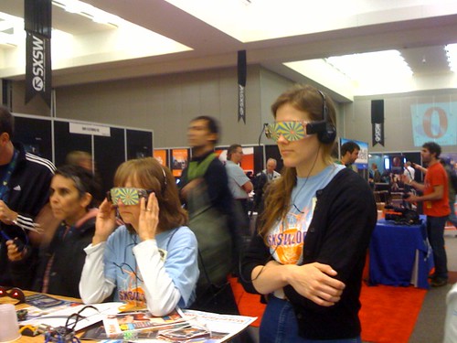
SXSW Interactive 2008


Trying to see the future of digital media.

I recently attended SXSW Interactive, a conference on new media in Austin, TX, from March 7-12. Attracting digital creatives as well as visionary technology entrepreneurs, the event celebrates the best minds and the brightest personalities of emerging technology.

Taking place on three floors of the Austin convention center, the event is overwhelming, with sessions beginning at 10 and running to 5 with bonus events and parties in the evening. There were usually about a dozen different things you could do at any time during the day. For example, at 11:30 on Saturday you could choose from panels on e-commerce, managing communities that work, Expression Engine 2.0 sneak peek, accessible rich media, the contextual web or “how to rawk SXSW and achieve geekgasm”. In addition to the panels, you could also go to book readings, take part in smaller “core conversations” on select topics, visit the trade show or pop into the ScreenBurn Gaming Fest.

The evenings featured parties and events where you could meet fellow techies. I went to the Dorkbot happy hour (geeks showing off their robots), a BikeHugger happy hour (with excellent barbecue), the SXSW Web Awards (sponsored by Adobe) and the “Rock Bands Rock Opera” party, sponsored by a company called Opera. These were excellent opportunities to drink free beer and meet other web folks from around the country.

It amazed me how tech-savvy the participants at the conference were. Nearly everyone had an iPhone, it seemed, and those who didn’t brought laptops to the conference to take advantage of the convention center’s speedy wifi service. The conference provided many handy online tools for participants. For example, I created my own calendar of events and downloaded it to my iPhone. SXSW also featured a mobile version of the conference program and a daily blog that I could read on my iPhone. I took notes on my iPhone so I didn’t need to carry paper around at all.

However, I was a Luddite compared to many people, who were updating what they were doing on Twitter and Facebook, uploading pictures to Flickr, making podcasts, and chatting about the sessions they were in in Meebo.

The overall theme of the conference was excitement over the future of the web. Participants in the conference shared an evangelical confidence in technology. This confidence was not placed in big companies but in small, organic teams, reflecting the DIY attitude of Austin and SXSW.

I’ll write more about the experience in the coming days.

Government Web Content Managers Workshop

I attended the Web Content Managers workshop on April 24 at the FDIC training center in Arlington. It was a great workshop, with lots of opportunities to meet other gov’t web folks and learn new things. Here are my notes from the conference:

Pierre Guillaume Wielezynski, The World Bank Group, “Social Media: Transforming Communication Between Government and Its Customers”

  • World Bank gets criticized in the blogosphere, drowning out the Bank’s message (this was before the latest scandal). The Bank needs to be part of the conversation rather than being defined by it.
  • Solution is to let groups of employees blog, provided that each blog has a strong governance body and that users are interested in it.
  • Example: Private Sector Development blog has personal stories of staffers in the field. This blog gets more traffic than their department’s web site.
  • “Communication 2.0” is to help the experts communicate rather than controlling the process.
  • Social media is evangelized throughout the organization by the installation of RSS readers, so staff can follow blogs, and a “BuzzMonitor”, showing mentions of the Bank across the web.

Alex Langshur, PublicInsite, “How to Re-Orient Our Websites Around Users’ Top Tasks and Get Top Management Support”

  • We should reorient our sites around the keywords that users use in searches, which demonstrate the type of content they want.  This means to change the categories of your site to match those keywords and to optimize your pages around those keywords.
  • Outdated pages should be deleted since they gum up your search results.
  • Use data on what users are “voting” on with their clicks to depersonalize the web site debate.  Let the data decide rather than the “Hippos” (highest-paid person in the room.)
  • What’s the mission of your site?  It must be a measurable criteria.  What are the top tasks of your users? Iterative improvement over time.  No major redesigns, just constant tweaks and changes.

Kathryn Summers, UMBC, “Getting Users From Point A to Point B: Designing & Writing Tasks for the Web”

  • Nearly 50% of the US population reads at an 8th grade-level or below.
  • Log-ins, forms and search are difficult for low literacy readers (she showed heartbreaking videos of older people who couldn’t figure out how to log in to banking sites).
  • Breaking up long paragraphs and sentences, avoiding acronyms, using simple words and shortening text are all ways of improving comprehension.  This also improves comprehension for high-literacy readers.

Brian Dunbar, NASA.gov, “Success Stories From the 2006 Web Best Practice Award Winners”

  • Web stats on usage are used to counter critics.
  • Most popular items on his site are images, lesson plans and mission coverage.
  • NASA is decentralized with multiple web sites.
  • NASA.gov is relaunching in October, the 50th anniversary of the agency.

Some (but not all) of the presentations from the meeting are online.