Coffeeneuring 5: Starbucks
Date: November 3, 2014
Distance: Ten miles
Why do you go to Starbucks? You go because you know exactly what you’ll get. From the logo on the cups to the layout of the bathroom, a Starbucks in San Diego is just like a Starbucks in New York. You can travel across the breadth of this nation (and around the world) and you can count on Starbucks to deliver the same coffee experience, no matter the location. This ability to deliver uniformity is a uniquely American talent.
Why can’t our genius for standardization be applied to bike lanes?
The thought occurred to me as I was at a Starbucks. Combining coffeeneuring with errandonnee, I was on my way to the Apple store in Georgetown. After taking the 15th St Cycletrack and and the M Street Cycletrack, I stopped at Starbucks for coffee. I went there because I knew what I would get.

But biking around DC, you never know what you’ll get. This city’s bike infrastructure is a wildly chaotic mess that changes by the day.
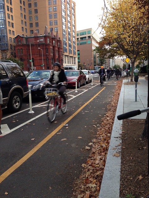
The DC Department of Transportation (DDOT) started out so well. The first cycletrack, on 15th Street, is perfectly designed. Bikes are protected from traffic by a line of parked cars. Lanes are marked, signage is good and it’s clear to everyone how the protected bike lane works, thanks to the efforts of reforming Mayor Fenty and DDOT Director Gabe Klein.
In contrast, the M Street Cycletrack was compromised from the start, by Mayor Gray, who sold out to the politically-connected Metropolitan AME Church. There would be no bike lane in front of the 1500 block of M Street, so that they could double-park cars all over street.

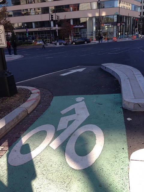
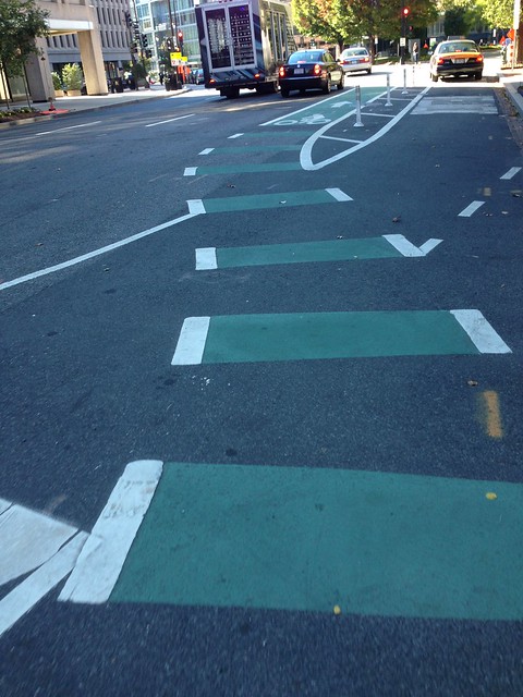
Heading west, it gets worse, as the cycletrack weaves in and out of bollards and parked cars. It leads you into traffic and cars merge into the track, blindly, as they attempt to turn right. This poor design has made it worse for cyclists and drivers. M Street before the cycletrack was safer.
Later in the week, as I returned to the Apple store, I discovered something even more dangerous than the M Street Cycletrack – the M Street Cycletrack at night. Navigating the serpentine cycletrack in the dark, as cars nip at your wheels is an experience only for the most daring of urban cyclists. Hope you have good health insurance.

Why can’t DC have cycletracks with the consistency of Starbucks? Why are they all chaotically different and hopelessly compromised? Why are they so poorly designed and so obviously unsafe?
This is a country that gave the world Apple and Google – we know and appreciate good design. We can create uniform cycletrack experiences, no matter the environment. And a good design already exists, on 15th Street. Take that template and apply it across the city. Give us safe cycletracks, DDOT.
Well said my friend. A badly designed bike lane is way more dangerous than NO bike lane at all.