“I’m not a usability expert.”
That’s what I said, prior to the recent NoVA UX Meetup, User Experience for the Experienced.
While I’ve worked on web sites my entire career, I’ve primarily been on the content side, as someone who writes, edits and manages web content. I’m a writer, not a designer, and have never convened focus groups to evaluate web site design or any of the other typical tasks of a UX expert.
Web sites are a mix of content, design and tech, perceived as a whole by users. While I have not identified my work as focused on usability, it’s inevitable that it does. Good, simple, usable web sites require good, simple, usable content.

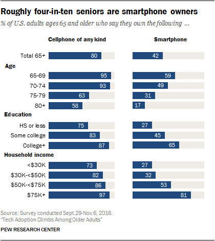
At the meetup, the AARP team spoke about the challenges of designing digital experiences for the 50+ audience. The stereotype is that “seniors” don’t use technology. But the fact is that older Americans are passionate users of iPhones and Facebook, just like the rest of us.
I worked on the AARP web site myself, in the late 90s. It was surprising how much older Americans took to the online world – particularly games, member discounts and romance.
While we wanted them to read articles about Social Security, the most popular section of the site was Member Benefits, for it contained the most relevant information for them, i.e., how to get discounts on travel and insurance.
Another surprise was what avid gamers they were, even when playing crossword puzzles on AOL via dial-up modem. We also created message boards to discuss serious topics, which were ignored, while members looked for love in the open chat forums.
The lesson is that the audience wants what it wants and there’s not much you can do about that. While users are determined when looking for something they want, like romance, they don’t have much patience for complicated design.
Ann Li, a usability expert for AARP, discussed a test she did on hamburger buttons. Popularized by the iPhone, these are the three little lines that you find on web site menus. Click on it, and an additional menu drops down beneath it.
They don’t work, as Li discovered, confirming research from the Nielson group. People do not understand three cryptic lines and don’t get that they can click on them.
I’ve looked at enough Google Analytics for the sites I’ve managed to know that hardly anyone uses menus. Visitors to your home page scan for relevant content and, if they can’t find it, they immediately go to Search.
Usability is simplicity. It’s using the terms that the public uses, not what you want to say. Li discussed another example – an online course on driver safety. Users flocked to the course, thinking that they could learn how to get discounts on car insurance.
The user is always right, as WordPress creator Matt Mullenwegg would say, even when they’re wrong. The course was renamed to make it clearer that it was about driver safety not driver discounts.
In government, where I worked for almost ten years, we never had money for usability testing. However, we had to comply with laws like Sec. 508, which mandates that web sites be accessible to all users, including the blind and disabled. That means that text alternatives have to be available for multimedia information. It forced you to make simpler sites, ones without annoying video intros and Flash.
Making sites accessible is about making them simple. It’s about using the terms that your audience uses. In Washington, we love specialized terminology, for it marks a person as “in the loop.”
Don’t do this. Instead, use simple words that the public knows.
And it’s a good practice, no matter the audience, according to Li. Making a site easy enough for seniors to use will benefit all readers. After all, not everyone is a native English speaker. Not everyone has a sleek laptop with a wifi connection. And there are a surprising number of people who still use AOL to access the web. Your audience is more than just tech-savvy millennials.
You don’t need to be a usability expert to design a usable web site. Focus on simplicity.
After all, you can’t fight Father Time. You’re going to get old. Design simple sites now, ones that all Americans can use.
Excellent follow-up thoughts – Thanks, Joe.